STACKSOURCE
STACKSOURCE
Creative Direction / Strategy / UX / Web Design
Creative Direction / Strategy / Web Design
Designing a better way to communicate a difficult UVP in commercial real estate lending

Project background
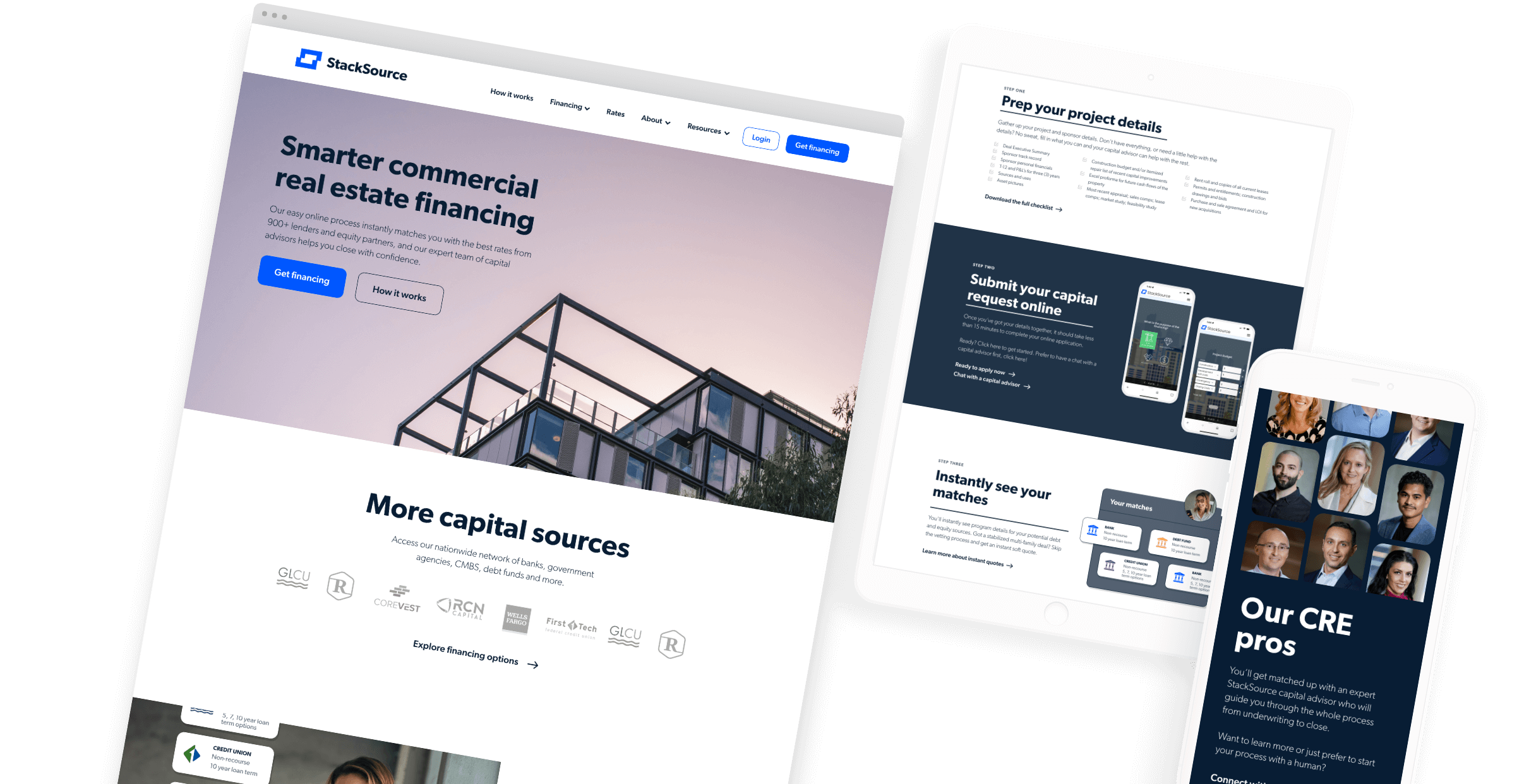
StackSource is a commercial real estate finance fintech backed by its own network of experienced brokers. The startup’s previous website was written and designed by its founders and its lack of clear value prop messaging and unprofessional design was hindering the website’s ability to drive conversions. With the addition of the company’s first marketing leader, it was time to elevate the professionalism of the website.
High-level goals
01 / BRANDING
- Elevate look and feel of the site to compete with modern fintechs
02 / USER EXPERIENCE
- Distill, simplify and communicate the 'How It Works' process in a way that lined up with how the product actually works
- Develop new information architecture balancing SEO goals and a smooth user experience.
- Introduce full funnel CTAs into the user experience to drive conversions as the only CTA previously was “get a loan”
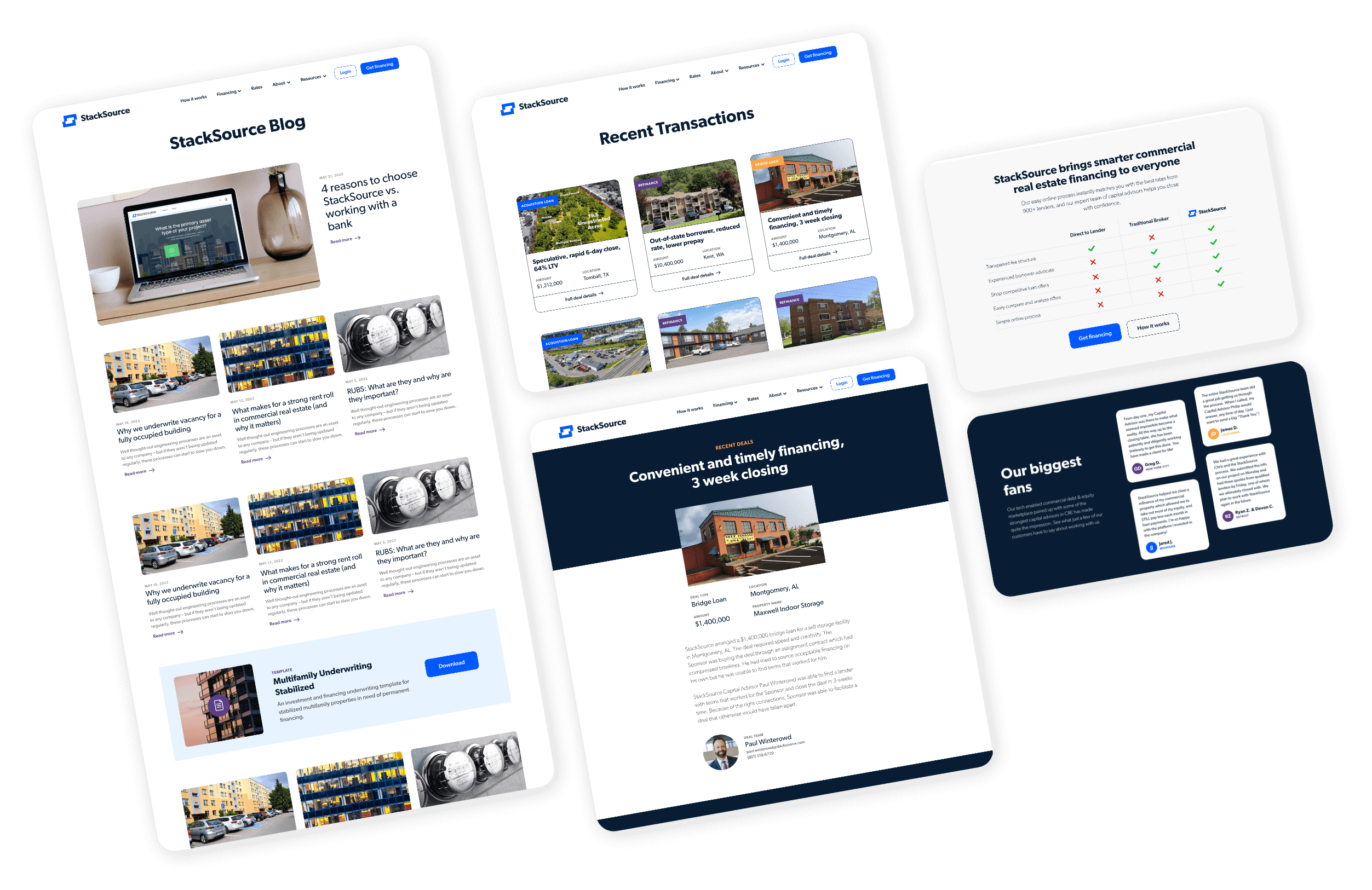
- Highlight educational blog content that was buried in the site and one of the top drivers of organic traffic
My role
I was responsible for everything: the new branding direction and design, website wireframes, prototypes, information architecture, visual design. The works.
- New branding design: updated logomark and lockup with new typography and proportions for better contrast
- Collaborated with internal stakeholders on high level UX and navigation as well as full information architecture (IA) which included schema for all SEO pages that would not be visible in the navigation.
- Collaborated closely with the director of marketing to develop appropriate messaging and CTA flows for the site
- Developed wireframes, prototypes and final visual design for the majority of the site
Research methodology
- Product demos
- Interviews with internal stakeholders: leadership, product, sales
- Value proposition workshop with internal stakeholders
- Customer interviews
- Google Analytics analysis reviewing user flow and drop off
- Competitive website UX and messaging audits

Logo revision
ORIGINAL LOGO

- Low contrast logomark
- Unbalanced logo execution
REDESIGNED LOGO

- High contrast logomark
- Bolder typography
- Better lockup proportions
- Modernized shade of blue
Process snapshot

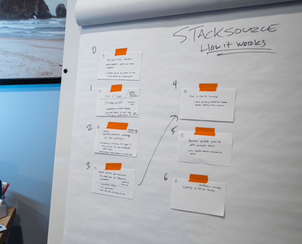
The previous website communicated an oversimplified 3-step ‘How it works’ process. The process was more complicated than that, which lead to customer frustration, so I facilitated a discovery session to dig into those details and see how we could communicate more appropriately without overcomplicating the message.
We landed on a 6-step process. We didn’t want to gloss over the details and make it seem easier than it was as that would create misalignment of customer expectations with how the product actually worked.

Post-launch
- I was unable to see this project through to completion as the director of marketing who was my primary collaborator left the organization. I provided all the files and their in-house product designer made substantive changes to launch an MVP version of the site, which is what is live now.
- Even though this project was not completed, the results of my collaboration with the marketing director did meet the goals of the project.
- The new 'How it Works' page I designed communicated the process in more detail without being overwhelming, and without being so simple it was misleading.
- I was able to balance the recommendations of the SEO contractor, spearheading a best of both worlds approach so that there were enough high level pages for humans that made sense while retaining SEO-optimized pages out of the navigation for the robots to bring search traffic to the site.


